As my personal art practice relates to the process of ordering objects, materials, data etc. an exhibition which really interested me was a room filled with oblong stone structures, a reminder for me of almost body/mummy/coffin- like structures with circular markings at ends to look like holes where faces would be, placed in what looked to be random separation on the floor, so you were able to walk throught the room, weaving in between these arrangements. The stone was of a sandy texture and colour, with unco-ordinating numbers drawn in chalk/ white paint of the ends of them, although not every structure was catalogued in this way. Planks of wood had been added underneath the stone structures as support and there was a contraption for moving the stones, with a handle, almost like a lever. The work was created by german artist Joseph Beuys, whose work mainly revolved around subjects of the World War and Auschwitz, maybe these relate to bodies/ soldiers/ victims of some of these horrors worldly known or experienced personally by Beuys himself.
When experiencing the work, there was a great sense that it was a temporary piece of work, that it could be moved at any time or was in the porcess of being moved around, that the art work was not quite finished or to the artist's satsfaction yet. Walking in between the structures, reminded me of walking through a graveyard, not only becasue of the body- like shape of them but the unnaturally shaped stone was a reminder of head stones on a grave.
For my own personal work, i took photos of the numbers written on some of the stones, as shown below. The process of numbering the stones shows some sense of ordering and handling of data, but the fact the stones shown in the exhibition had no correspondence to each other but just as random numbers, there is also a lack of organisation.
Another memorable exhibtion from the Hamburger Bahnhof was called 'DB' by japanese artist Ryoji Ikeda, whose seperated but still linked installations at opposite ends of the gallery experimented with pitch in continuous sound, and continuous numbers/ fuzzy white noise/ dark and light/ white and black etc. Here is the desciption of the exhibition on the wall outside the exhibition:
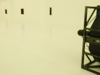
Experiencing this exhibition was very surreal, and visiting both rooms were on completely other ends of the spectrum and had a totally different effect on me. I visited the white room first, which was so white we had to wear plastic shoe protecters to keep the floor perfectly white. The room had a massive speaker at one end, which is the same for both the white and black room, eminating from it was an extremely high pitched note, something which caused me to leave the room after a short visit; the noise was something that would definately send you mad after prolongingly hearing it. Here are some photos of the white room below.
In the black room, the layout was pretty much the same, the differences being the pitched note being eminated from the speaker was a lot lower, obviously the room was pitch black. But the variations were the bright white light sourec throwing a beam o light onto the opposite wall, creating a pathway through the centre. At symmetrical points at the sides of the room, there were numerous projections showing a continuous flow of numbers being formed/ processed that looked almost fuzzy, and then the numbers suddenely freezing for a moment. The numbers in this room made me feel like everything was rushing past me really quickly and i was stuck in the present.
Another thing worth mentioning which i almost forgot was that on entering the rooms, walls outside showed lines of 'D' versus 'B' words, which corresponded to each other. Photos below give you the idea of what this was about, but reading the words down the wall gave you a sense of the opposites shown in the whole exhibition (white/ black, dark/ light, good/ bad, heaven/ hell, tranquility/ disturbance).


No comments:
Post a Comment