Sunday, 10 March 2013

Museo del Prado, Madrid, 20- 22 February 2013

Recent travels have taken me to the bustling city of Madrid, recommended for of course, the art galleries. With only a few days to spare in the country, I visited only the best known galleries and museums recommended to me, and consequently spent my evenings sipping sangria and digging into plates of paella. That aside, I have many exhibitions and places to introduce and recommend, the first of these being the Museo del Prado, situated in the heart of the city and boasting a collection that currently comprises around 7,600 paintings, 1,000 sculptures, 4,800 prints and 8,200 drawings, in addition to a large number of other works of art and historic documents. Works created from as early as the 12th century to the 19th century fill every space of this historic site, originally designed on orders of Charles III to house the Natural History Cabinet.


Works of particular recommendation were a vast collection of paintings by Francisco Goya; The Clothed Maja (1800-1808), The Naked Maja (before 1800), The Drowning Dog (1820-1823) and many other paintings and drawings by the artist. Seeing these paintings online or in books is no comparison to seeing them in reality. Although these works are some of Goya's best known works, the most famous piece in the whole of the museum is Las Meninas by Diego Velazquez (1656), which has been recognised as one of the most important paintings in Western art history.


The Clothed Maja, 1800-1808


The Naked Maja, Before 1800


The Drowning Dog, 1820-1823


Las Meninas, Diego Velazquez, 1656

Sunday, 20 January 2013

Random International: Rain Room, The Barbican, 04 October 2012- 03 March 2013

Rain Room is an experiential and interactive installation piece, a 100 square metre field of falling water for visitors to walk through and experience how it might feel to control the rain, exploring the idea of trust and disbelief in something so unimaginable. Being the biggest and most ambitious installation The Barbican has exhibited to date, the two hour queue to see this marvel was well worth the wait. Sensors within the room allowed the rain to react to sound and movement, and being able to walk under water droplets and stay completely dry whilst being surrounded with falling water was a magical experience, almost like an invisible umbrella. Playing and fighting against the forces of nature was a strange feeling and one that is definitely recommendable.


 ‘Random International combines aesthetic purity and technical sophistication to create works, often hard won, that explore materiality and immateriality, the animate and inanimate alike. New technologies form the basis of their work which nonetheless draws on op art, kinetics and post-minimalism. Cross-disciplinary collaborations are enthusiastically embraced by the studios. 
In Rain Room, Random International invites you to experience what it’s like to control the rain and put your trust in the work to the test. More than the technical virtuosity necessary for its success, the piece relies on a sculptural rigour, with the entire Curve transformed by the monumental proportions of this carefully choreographed downpour and the sound of water. Rain Room encapsulates Random International’s ethos of experimentation with human behaviour an interactive processes. It also invites us to explore what role science, technology and human ingenuity might play in stabilising our environment… The significance of the technology melts away and becomes invisible, foregrounding instead the participant and their personal journey within the piece.’

Listening Post, Mark Hansen and Ben Rubin, The Natural Science Museum

Greatly suggested Listening Post is an electronic art installation, collecting and sharing a live, uncensored stream of fragmented text, shown in real-time to the curious, and arguably invasive public. Words and phrases from public internet chat-rooms, bulletin boards and other online public forums are filtered and ordered to movements in a symphony, displayed on tiny text screens in patterns and waves. Speakers placed around the room play different fragments of conversations at different moments as though a live stream of information is travelling around an individual's existence. This piece is an extraordinary snapshot of the internet as never experienced before and gives a fantastic incite into the millions of identities expressed online. As more and more voices start to talk, and text becomes more and more disjointed, almost transformed into white noise, this hypnotic piece could have you sitting there for hours watching and listening intently.


'Listening Post is a ‘dynamic portrait’ of online communication, displaying uncensored fragments of text, sampled in real-time, from public internet chat-rooms and bulletin boards. Artists Mark Hansen and Ben Rubin have divided their work into seven separate ‘scenes’ akin to movements in a symphony. Each scene has its own ‘internal logic’, sifting, filtering and ordering the text fragments in different ways.
Listening Post is an extraordinary investigation into the character of online communication and the meaning and malleability of statistics. It is a recognised masterpiece of electronic and contemporary art, but Hansen and Rubin’s use of media technologies and sophisticated data analysis techniques differentiates it from traditional visual art. It relies not only on materials and the built environment, but also on text data quoted from the thousands of unwitting contributors’ postings.
As Listening Post carries out its eavesdropping cycles and displays its findings to us, it implicates us in its voyeuristic activities. But we also experience a great sense of the humanity behind the data. Hansen and Rubin have almost created a modern-day oracle, a snapshot of the internet as we know it today and a monument to the ways we find t connect with each other and express our identities online.' (Hannah Redler, Head of Museum Arts Projects)

Tuesday, 1 January 2013

The Bloomberg Commission: Giuseppe Penone: Spazio di Luce (Space of Light), Giuseppe Penone, The Whitechapel Gallery, 05 September 2012- August 2013

Highly recommended exhibition Spazio di Luce is an installational piece focussing on the relationship between the manmade modern world and untouched nature. The hollow cast of a tree trunk and surrounding branches leave something to contemplate. The life and soul of a tree has almost been stripped bare and reduced to a sad empty shell; the gold leaf is a precious reminder of this life and light. Complimenting the sculpture, walking into the gallery space the sound of a ticking clock adds a sense of time to an otherwise timeless subject, no tell-tale tree rings unfolding the decades. Time has been explored recently in my own art practice, and the rings in trees have been the compared sculpturally alongside tiny layered paper sculptures I have created and will dissect in half, much like the felling of a tree.


'Over the past 45 years, Italian artist Giuseppe Penone has examined our relationship to nature. For the latest Bloomberg Commission, he has created a twelve metre bronze cast of a tree, with a radiant gold leaf interior, which spreads across the columned gallery.
In 1969 Giuseppe Penone (b.1947) covered a tree in a thin layer of wax calling this seemingly simple, yet complex reflection on the passing of time All the Years of the Tree Plus One. He now recalls this poetic action by casting a layer of wax in bronze to spectacular result.
At first sight Spazio di Luce (Space of Light), could easily be mistaken for the straightforward life-size cast of a large larch tree. However, where once there was a tree now there is a void. The inside of the cast replicates in minute detail the tree's bark while the fingerprints on the outside safeguard the memory of the many hands involved in the sculpture's making.
The gleaming gold inside the tree pays tribute to the life-giving forces of light. At the same time, the fusion of bark and handprints alludes to the inseparable bond between humankind and nature.
Penone was part of the legendary group of Arte Povera, which called for a radical rethink of society through making works directly appealing to the senses and challenging common conventions of art making. the installation is accompanied by a yearlong programme of talks an events exploring the rich relationship between nature and the city.' (The Whitechapel Gallery. (2012). The Bloomberg Commission: Giuseppe Penone: Spazio di Luce (Space of Light). Autumn 2012- Whitechapel Gallery.)

If The Colour Changes, Mel Bochner, The Whitechapel Gallery, 21 October- 30 December 2012

Although this exhibition has shortly been and gone, this is definitely one to record and an artist worth making note of in my opinion. Exploring the use and display of words in comparison to meaning and colour, If The Colour Changes shows a juxtaposition between words otherwise quite ordinary and everyday alongside a disciplined action to create an aesthetic series of works, 'using a thesaurus to generate word chains that are both mordantly funny and bursting with colour.' Interesting to experience is the generated feelings and mood from reading the connected words, whether fun and playful or aggressive and angry; the colour highlighting or dulling the tone.


 'Descending from phrases such as 'top dog' and 'king of the hill' into macho mantras such as 'rule with an iron hand', the latest paintings of American artist Mel Bochner (b.1940) use a thesaurus to generate word chains that are both mordantly funny and bursting with colour.
Tracing nearly 50 years of work, this exhibition commences with Blah, Blah, Blah (2011) a huge painting that encapsulates Bochner's on-going fascination with language and with colour. Across the floor, blue squares are spray-painted onto newspapers in a fusion of geometric abstraction with current affairs. Giant crumpled photographs in lurid colours, described by the New Yorker as 'like road maps found stuffed in the glove compartment', hang around the walls.
In a reprise of Marcel Duchamp's painting Nude Descending A Staircase, a scattering of 48 inch lines occupies the Gallery staircase. At the top No Thought Exists Without A Sustaining Support (1970), is chalked onto a blackboard that appears to drip down the wall. Exuberant planes of colour leap across the walls of Gallery 9 with Two Planar Arcs (1977) and a sculpture made in vividly chromatic chunks of raw glass.
Gallery 8 is devoted to the vast Event Horizon (1998) and 'Thesaurus' paintings, including Amazing! (2011) featuring exclamations from 'awesome!' and 'groovy!' to 'gnarly!' and 'omg!', whose letters and words advance or recede according to the shade. Bochner takes us on a cerebral, optical and physical journey.' (The Whitechapel Gallery. (2012). Mel Bochner: If The Colour Changes. Autumn 2012- Whitechapel Gallery)

Similarities can be made between Bochner's work and my own in some ways, a personal interest in systems, categorising, ordering and rationalising subjects that are otherwise uncontrollable or uneasily arranged: 'Bochner shares with other artists who emerged in the 1960s, including Sol LeWitt, Eva Hesse and Robert Smithson, an interest in using rationalising systems- numbers, measurements, definitions- to explore the irrational and provisional nature of being.' As part of my own art practice I have been recording my dreams for the last nine months and hope to continue recording until a year's worth has been catalogued. What I will do with the information I have gathered it yet to be confirmed although using dates, times and finding patterns within a dream cycle is something I would like to explore, and then perhaps creating a piece of work surrounding these ideas. Dreams cannot be easily understood and the juxtaposition between this and the dissecting of this information is a concept I would like to carry forward.

Tuesday, 23 October 2012

The Vanity of Small Differences, Grayson Perry, The Victoria Miro, 07 June- 11 August 2012

Although this exhibition has been long gone, i have made the decision to write a short essay on the six tapestries, mainly for my own remembrance of the symbolic and religious structures within the work but also for anyone who may be interested in what it all meant. This was written a while ago but just didnt get round to publishing it so apologies for the lateness, however this exhibition fascinated me.

Grayson Perry has been observing certain aspects of British public; watching what people wear, people’s hobbies, and inspecting possessions. He has been getting an insight into the personal lives of the working, middle and upper classes, the details of modern life, and the truths those details reveal about certain communities. What is behind people’s choices to buy certain things and live in a particular way? What do individuals think about themselves? Perry has been on safari through the taste tribes of Britain, looking at events and rituals that reveal the most about someone’s class and background, to produce six panoramic tapestries for an exhibition at the Victoria Miro Gallery, The Vanity of Small Differences.Beginning his investigation in Sunderland, a city with strong working class traditions, Perry looks at how early upbringing can have an effect on later life, and the traditions of the men and women to show they belong to the ‘tribe’. He notices how the middle and upper classes look down on the lower classes in a snobbish way, but what taste defines the lower classes? What is working class taste? Sunderland’s men drive fast cars with subs, have big tattoos and practice cage fighting as a primitive or even sexual display whereas the women wear short dresses, big hair, and fake tan; they are their dream persona at the weekend when they go out as an escape from reality. It is ‘beauty you can measure with a ruler’, there are ‘standards that have to be met’. Just because someone belongs to a tribe, does that mean they enjoy it or could they want to escape it? This is another idea behind Grayson Perry’s work, not only trying to define the taste in the class system but also the feelings from the classes themselves. The Adoration of the Cage Fighters is the first of six tapestries produced for this exhibition. The first words on the tapestry communicate: ‘I could’ve gone to uni’ which is a poignant statement to illustrate the ticket to a better life that education can have. The main figure on the right is mirrored to the figure in Adoration of the Shepherds by Mantegna; all six of the tapestries have references to religious paintings.


The Adoration of the Cage Fighters

Two cage fighters kneel before the main figure offering membership to the working class just as four ladies on the right are trying to persuade the figure to ‘come out for a drink on a Friday night’. The grandmother in the centre will surely stay at home and look after the baby. The baby is symbolic of Tom Rakewell, illustrated in the series of paintings by William Hogarth called A Rake’s Progress. For these tapestries, Grayson Perry has changed the name to Tim Rakewell to modernise the character, which appears in the other six works as a progression, such as the influence of Hogarth; his paintings just as relevant today as when they were created in 1733.

The Adoration of the Shepherds, Andrea Mantegna, 1450

The second tapestry in relevance to the working class taste is called The Agony in the Car Park inspired by a singer Perry met in a night club in Sunderland. The words on the tapestry read: ‘Ship building bound this town together like a religion’, referring to the working class traditional occupations of the area and showing the story of class mobility. On the right of the tapestry, boy racers have ‘Mating Call’ stamped on their cars to symbolise the reasoning behind these young men’s choices and the rituals that ‘get the girls.’ This scene is a lot more emotionally charged and so refers to the emotional structures that form taste. The composition of the piece is associated with two religious paintings; The Agony in the Garden by Giovanni Bellini, and the Isenheim Altarpiece by Matthias Grunewald, which both have a main figure centred in the painting with smaller figures surrounding or gathering round. Furthermore, the viewpoint is mostly similar to The Agony in the Garden as the viewer’s perspective is very high up, showing the surrounding landscape.


The Agony in the Carpark


The Agony in the Garden,
Giovanni Bellini, 1465


Isenheim Altarpiece,
Matthias Grunewald, 1512-16
The working class have been summarised in these first two tapestries, the cage fighting, the ‘mating call cars’, the dressed up girls, the lack of education to the working classes, and their own individual tastes and choices. They answer the question: ‘Who do we think we are?’
Stereotyping the classes, general views of the public consider the middle classes to have more aspiration than the working classes, opting for branded and more corporate clothing, Land Rovers, dinner parties etc. to subtly give off signals of richness including the cleanliness and perfection of houses. As Grayson Perry considers himself to be middle class, he wonders, is there an upper middle class and a lower middle class? Are the middle classes separated into tribes? Does the more money you have mean the more choices you can make which ultimately mean better taste? But what is better taste? The middle class are considered self- made people, but also people who are not certain of their place in society, being somewhere in between. This lost identity of the middle classes causes angst and agony in looking effortless, feeling a sense of not belonging and therefore wanting to belong.
Expulsion from Number 8 Eden Close is the third tapestry in the series, showing snippets of taste in the middle classes. The two figures in the middle represent Tim Rakewell and his girlfriend (in referral to Tom Rakewell in Hogarth’s A Rate’s Progress) and mirror Adam and Eve in another religious painting Adam and Eve Expelled from Paradise, painted by Masaccio in 1424-25. The split between the two scenes illustrates the lack of belonging in the middle classes; tiny details from Grayson Perry’s research in Tunbridge Wells are noticed also, the William Morris wallpaper, the Land Rover, the golf, the homemade cupcakes and the obsessive cleaning rituals of ‘perfect housewives.’ The chalice in the painting symbolises the middle classes and can be seen in the twinned middle class piece, The Annunciation of the Virgin Deal.
Expulsion from Number 8 Eden Close

Expulsion from the Garden of Eden, Masaccio, 1424-25 
The possessions and still life of the middle classes is emphasised in The Annunciation of the Virgin Deal, with a Cath Kidston handbag, Penguin book mugs, iPads, car keys and Union Jack printed cushions. The narrative shows Tim Rakewell’s business partner (portrayed as an angel) coming to share the news that he has successfully sold his company to virgin for £270 million pounds, which can be seen in an article on the screen of the iPad. Tim Rakewell sits comfortably on his sofa with his child in his arms and his wife in the kitchen, enjoying his wealth. The coffee jug in the centre is the central icon of the middle classes, just as the chalice was a reference in the previous tapestry. The middle classes are most aware of what they buy, why they buy it and the effect it will have on them and how they are portrayed by others around them. They are self- conscious of the whole taste phenomenon, and there is competition in who can be the most individual.

The Annunciation of the Virgin Deal
The Annunciation, Giotto Di Bondone, 1305

In search of the traditional upper class taste, Perry visits the Cotswolds, filled with mansions and stately homes, where people are stuck in their aristocratic ways, describing themselves as good quality, understated, appropriate and flawless, ‘the posher the person, the less they have to prove.’ There is a spell that is cast over everyone by the upper class, the intimidation felt and the ‘perfection’ that seems to radiate from them. Clothing is deemed more a uniform than a way to express personality, the upper classes have a stronger family tree and so the upkeep of a family’s reputation than be more important than finding one’s own person. Ancestors portraits hang in hallways, clothes are handed down through generations from mothers, grandmothers and great grandmothers, still worn today; very English and very historical. But when faced with the pressure of carrying on tradition, whether this may be inheriting property or taking over a family business, does this make it harder to develop a personal taste? Does upper class taste mean not having any taste at all and just carrying on with what has always been done?
Lord Bath, or Alexander Thynn, the 7th marquess of Bath and owner of Longleat House in Somerset, broke out of these traditions, and transformed one wing of the house into a blank space where he could redesign and paint anything and anywhere he wanted, filling it quickly with his own art, very much with a Bohemian taste. He commented: ‘My space, my canvas.’ which is a powerful statement to show the contrast with the lack of change in upper classes. They are an endangered tribe; they are fighting for survival in an age where the modern world is slowly destroying a traditionalist culture.


The Upper Class at Bay

This can be depicted in The Upper Class at Bay, the fifth tapestry to define the third type of class, showing the ideas and tastes coming to a dead end. The upper class is portrayed as prey or an endangered species brought down- ‘The Hunter and the Hunted.’ Tim Rakewell is viewed on the right with his wife, witnessing the killing of a tatty, tweedy old stag. The stag represents a dying patriarch who has run his course and is being mauled by the ‘dogs of tax’. The distortion which can be seen in not just this tapestry, but all six, gives a nightmarish quality and a hazy sense of reality. The stag is being watched with satisfaction that the old is being undermined by the new.


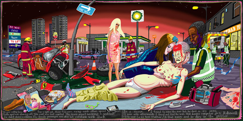
#Lamentation

The Lamentation, Rogier Van Der Velden, 1441

#Lamentation is the final scene that completes the series, in which Tim Rakewell has brought himself a new car and in flaunting this to his new wife, races down the street, only to end up crunched into a lamp post, flying through the windscreen and ending dying in the gutter in a tragic turn of events. Accessories scattered around him illustrate the celebrity lifestyle, being featured in the latest ‘Hello’ magazine, his iPhone smashed up, his blonde bombshell wife standing distraught in the road. The hash tag at the beginning of the title refers to the audience of people in the scene, tweeting pictures and status updates of the celebrity crash, oblivious to the feelings of dying Tim Rakewell. The composition mirrors A Lamentation by Rogier Van Der Velden, the religious undertones contrast with the false, money-grabbing life of Tim Rakewell in his success through the classes to the top.

Wednesday, 3 October 2012

The Search for Immortality: Tomb Treasures of Han China, The Fitzwilliam Museum, 5 May- 11 November 2012

'Featuring over 350 royal treasures, exquisitely crafted in jade, gold, silver and bronze, The Search for Immortality is the most important exhibition of ancient Chinese art ever shown in Britain. It is also the first time the spectacular archeological finds of the Han family royal burials from their ancestral home town of Xuzhou have been brought together with the treasures from the tomb of the King of Nanyue in southern China, who also aspired to the title of 'emporer'.The exhibition explores these kings' quest for immortality and the struggle for imperial legitimacy in ancient China's Han Dynasty, which established the basis for unified rule of China up to the present day.', (The Fitzwilliam Museum)

This is an eye-opening exhibition to the art forms of ancient China, the immense decorative detail that goes into even the most normal of objects for the royalty of the 2nd century BC. Weapons, body suits, coffins, musical instruments, ornaments, plaques, basins and gold seals make up just some of the artifacts in this huge gathering. Personally, the incredible sense of social status and riches was the most surprising thing about The Search for Immortality, everything was made from gold and jade and other priceless materials. When looking at the work, the symbolism within some of the decorative detail was fascinating, and there was a strong feeling of the celebration of life and afterlife in looking at the burial gifts and burial suits.


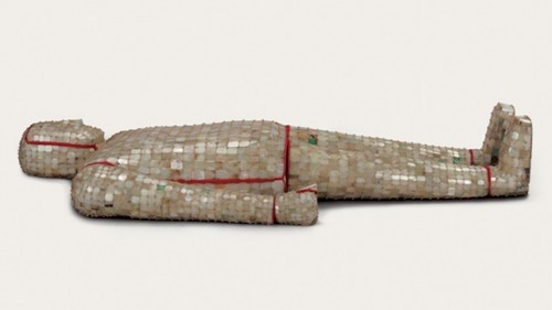
Here is a photo of one of the burial suits in the exhibition, which were worn only by royalty, and made from stitching together plates of jade stone. The one above is composed of 4,248 jade plaques, sewn with 1,576 grams of gold thread. The suits are so old that the jade has lost its green colour. In my opinion, this was the most impressive piece in the whole exhibition.
Below are some of the other pieces i found particularly interesting. Overall, this exhibition was really enjoyable and i would definately recommend it for the viewing of these rare artifacts and the fascinating stories you can learn behind them.


Gold belt plaque, 2nd century BC, Western Han dynasty


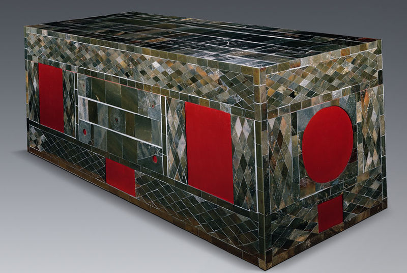
Jade coffin, 2nd century BC, Western Han dynasty


Leopard-shaped stone weight, 2nd century BC, Western Han dynasty